The truth is, more than a month after the revamp, traffic still hasn’t started to bounce back. Whether you’re looking at traffic rank, reach, pageviews (%), or especially pageviews per user, Gawker has not yet come close to reaching its old heights. So this begs the question: why? Was the redesign really so bad that it drove away more than 25% of readers?
I’ve thought a lot about this question, and my gut says no. Sure, there are problems with the new user experience, but nothing so egregious that people should be swearing off Gawker forever. So if the site design isn’t what is keeping people away, it must be something else. It must be the content.
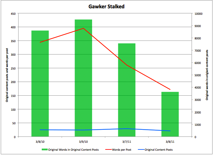
To find out what changes were happening to Gawker’s content over time, I selected two time periods: Monday, March 7 and Tuesday, March 8 of this year (March 7 selected because it is exactly one month after the redesign was launched), and Monday, March 8 and Tuesday, March 9 of 2010. My intent was to compare the amount of original content produced before and after the redesign. To do so, I classified all posts in each day into one of four categories: Original Content, Links (to other Gawker media sites), Roundups, and “Blurbs.” See the end of this piece for further explanation of these categories. Next, I did a word count of all Original Content posts, with pull-quotes removed. Finally, I found the ratio of non-quote words in Original Content to the number of Original Content posts that day. The results were shocking.
As you can see above, while the number of Original Content posts has stayed roughly the same over time, the amount written has dropped precipitously. Out of fairness, one 1,630-word Oscars summary post from March 8, 2010 was excluded from the tally because it seemed unfair to compare it against the 2011 data, when the Oscars were held weeks prior. Even with this adjustment, last year’s Gawker was producing significantly more substantial Original Content than the FrankenGawker of today’s internet/television/magazine gallimaufry. Part of this can be explained away by the fact that Richard Lawson does not seem to be writing as many epic T.V. recaps as he did in 2010, but the discrepancy cannot be attributed to this alone—after all, a 2,800-word post on The Real Housewives of Orange County was included in the March 7, 2011 data.


I remember when Denton changed the commenting system a couple years back, I think a lot of the regular Gawker commenters said to themselves “If I had the will power, I’d leave this place.”
Of course, we didn’t leave.
This redesign is different. I wish I could keep reading and commenting on Gawker but the website’s functionality is so broken that I’ve been forced to find new places.
Tried accessing the site from android lately? It doesn’t work. Rest has been covered well by commeters above. Horrible idea. Lucky for him, he doesn’t have stockholders, else he’d be fired, along with incompetent monkeys that coded the new site design. I miss the site but not the blatant “f*ck you, readers” version that’s there now.
I think you’re wrong, I refuse to visit any of their sites until they come up with a better format or revert to their former format. I used to visit Lifehacker and Gizmodo many times a day and now do not visit at all ever.
Gawker’s redesign was a complete FAIL because it was so buggy and because it was fundamentally contrary to the way its readership had come to use the site. Add to that Mr. Denton’s de-emphasis on Gawker’s clever commentariat and the new Gawker simply became not worth the effort. I can read all of those stories elsewhere on the web without the hassle.
It wasn’t simply the lesser writing or the format being bad that drove people away, it was that the format didn’t work at all on a lot of browsers. When the switch first happened, I couldn’t access any of the Gawker Media websites for a week. The pages simply wouldn’t load on my browser. At all.
I like Gawker, but I’m not about to go download a different web browser just so I can read it.
It’s beyond major web design failure when a significant portion of readers cannot even access your content.
Denton has destroyed his flagship. It went from being a go-to site every day to being a no-go site in a blink. I really mourn the gawker that was. Apparently Denton did not like the insider community that existed. He needed new hits.
Take this, Nick!
The amount of interesting content has definitely declined. It’s disappointing to click a headline and see that all the author did was link to an article and type one or two sentences, and lately those posts are very common.
At the same time, the redesign negatively affected the commenter community. It was incredibly difficult to post and read comments when the redesign first came out. The confusing new tabs made unstarred commenters even less visible, because “featured” meant one featured comment, “all” meant all starred commenters, and the link to see every comment was down at the bottom. I think it unfortunately made unstarred commenters feel like nobody would see what they wrote. Things are working better now in the comments, but I think a lot of people got out of the habit of commenting. Also, a bunch of “elite” Gawker commenters left and started their own website.
Since a lot of people kept coming back to follow discussions, the buggy comments section hurt the site too. And they needed interesting comments more than ever when they dialed back the content in favor of links. Why stay on Gawker after you click the link if there isn’t a good discussion in the comments? It was the trifecta of annoying, buggy design, worse content, and fewer comments. I still visit the site, but not as often.
People like myself left Gawker media’s webpages because they tried to force some kind of self-fabricated design belief down everyone’s throats. We’re all big boys and girls and we use Gawker sites like Jalopnik or Gizmodo for recreation. We’re not trying to learn some new convoluted format so that you can sell more ad space along the left and right sides. Also insulting was that you were going to decide for the viewer what stories to ‘highlight’ because you devoted the most effort and funds into via staff and connections. People go to websites to read the things they are interested in. It was a natural flow of information you could pick out before. Just like window shopping. Social media emphasizes this customization and over editing to it’s own peril. Look at Digg.